

Informations
About Phlegm
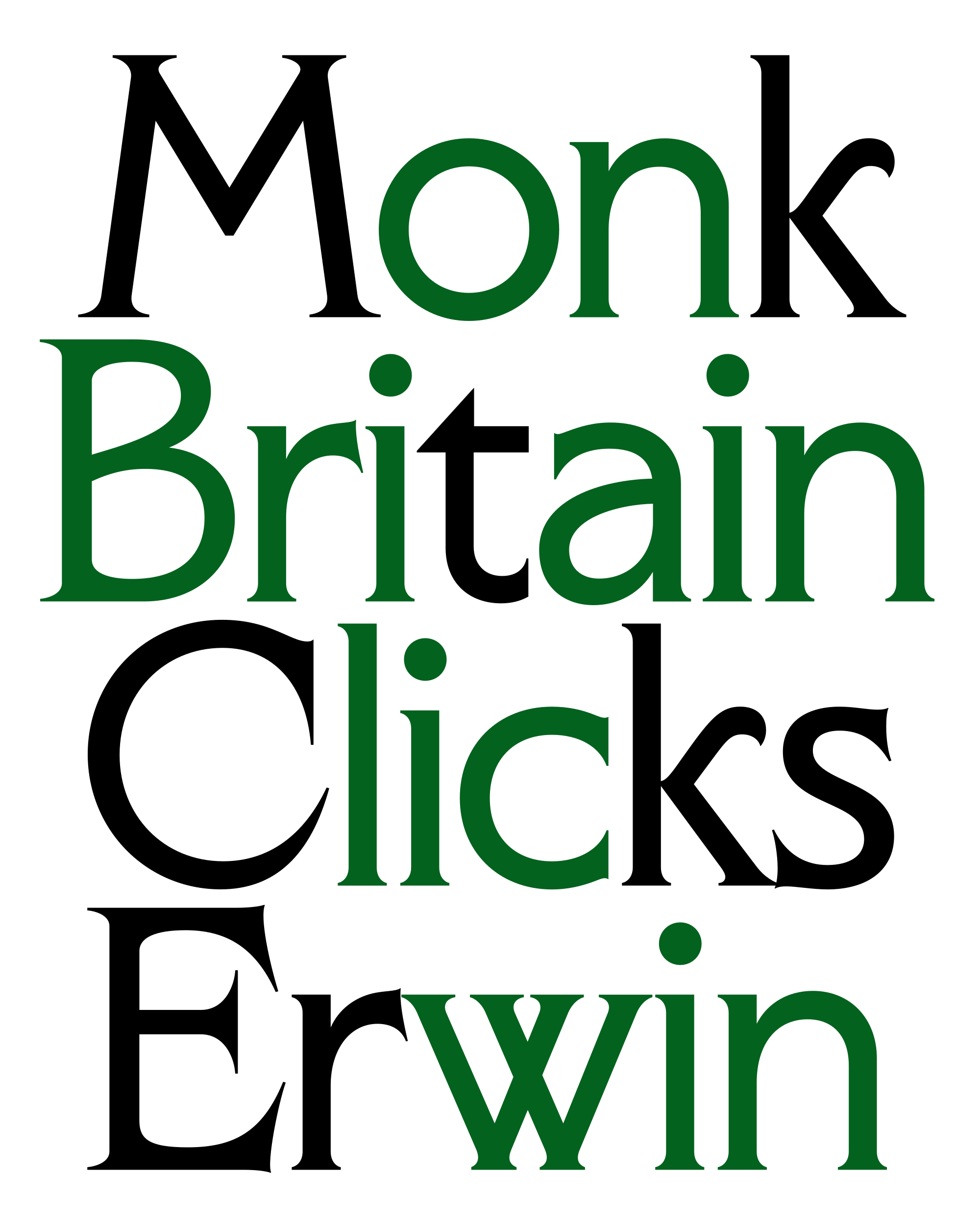
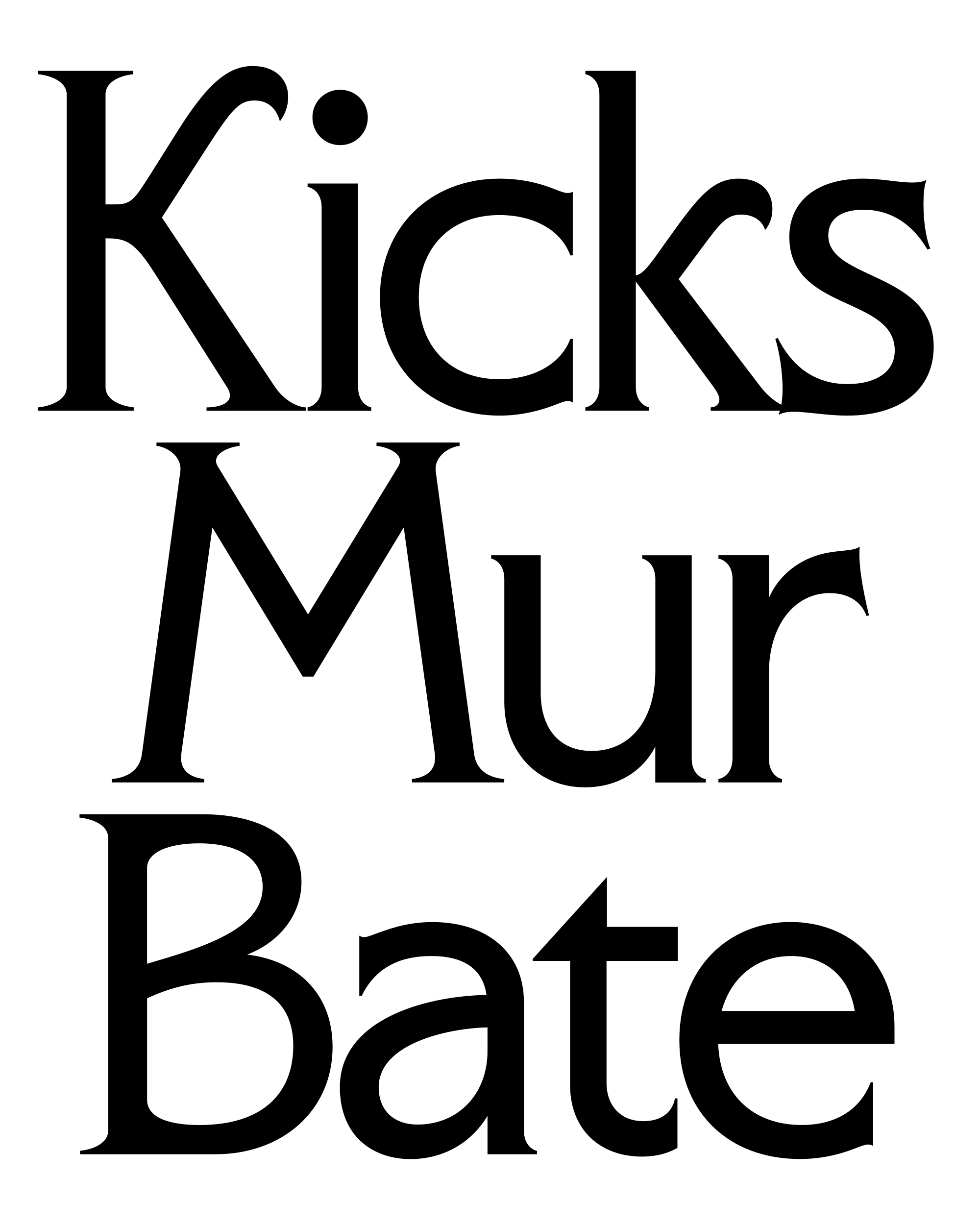
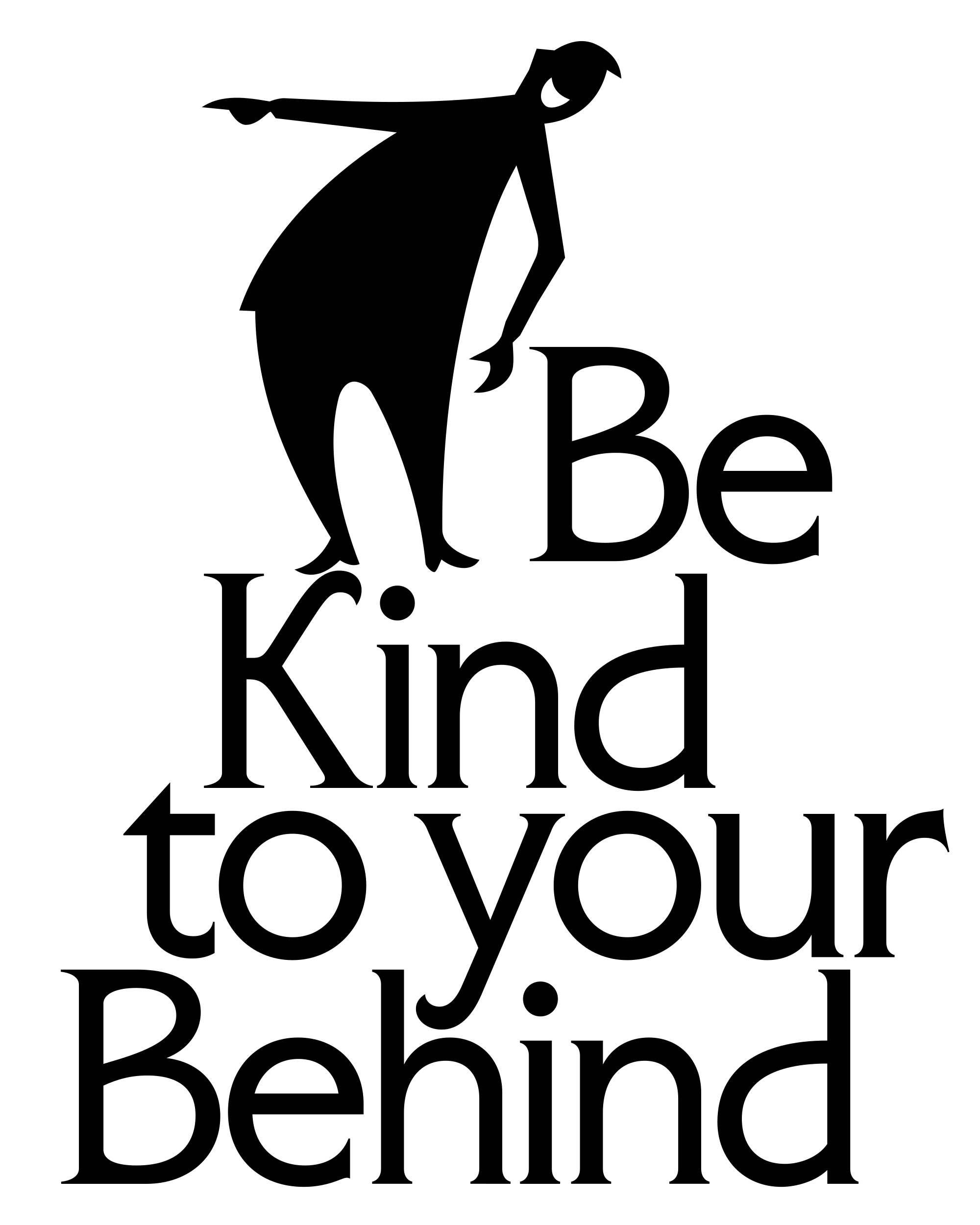
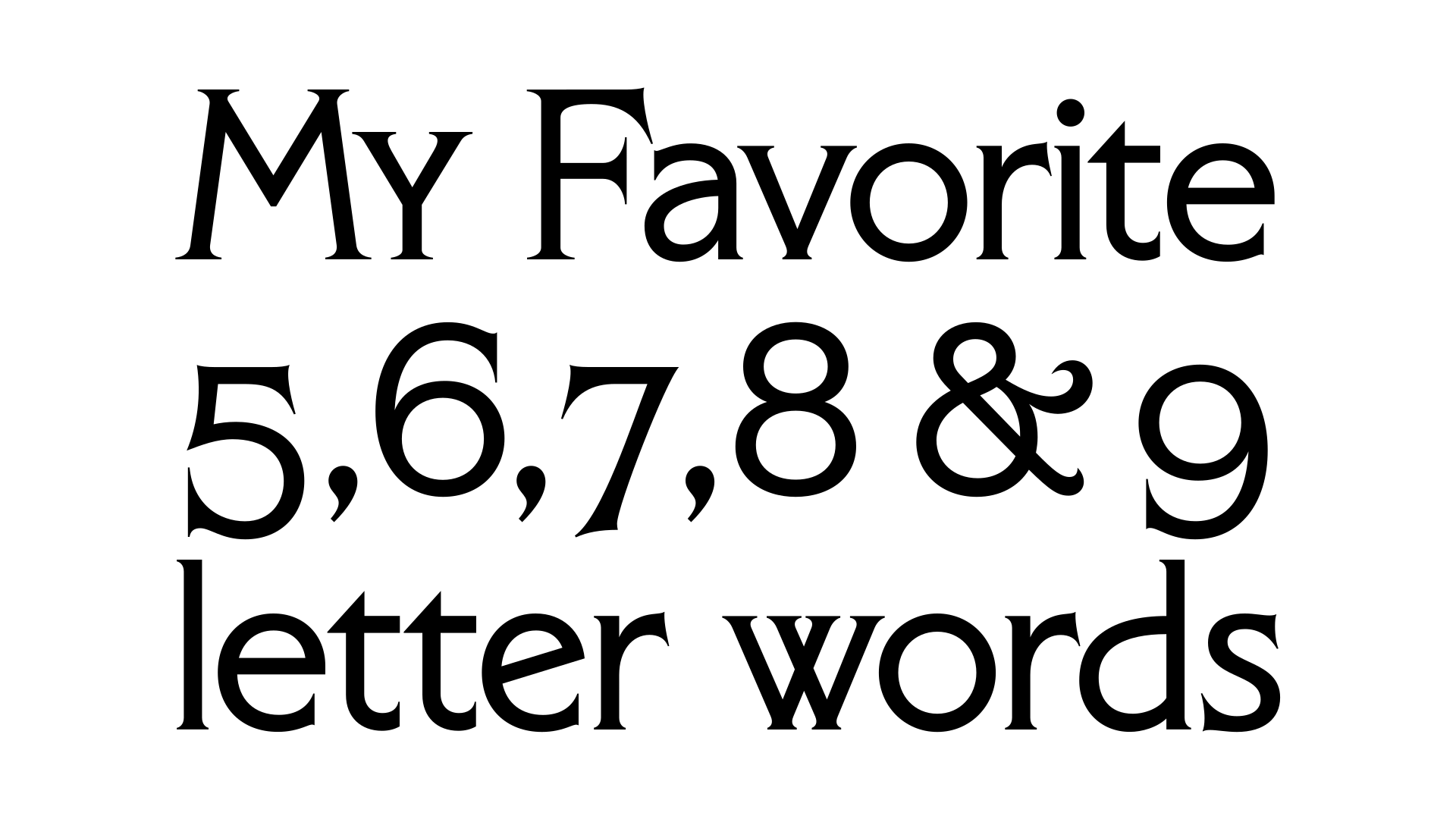
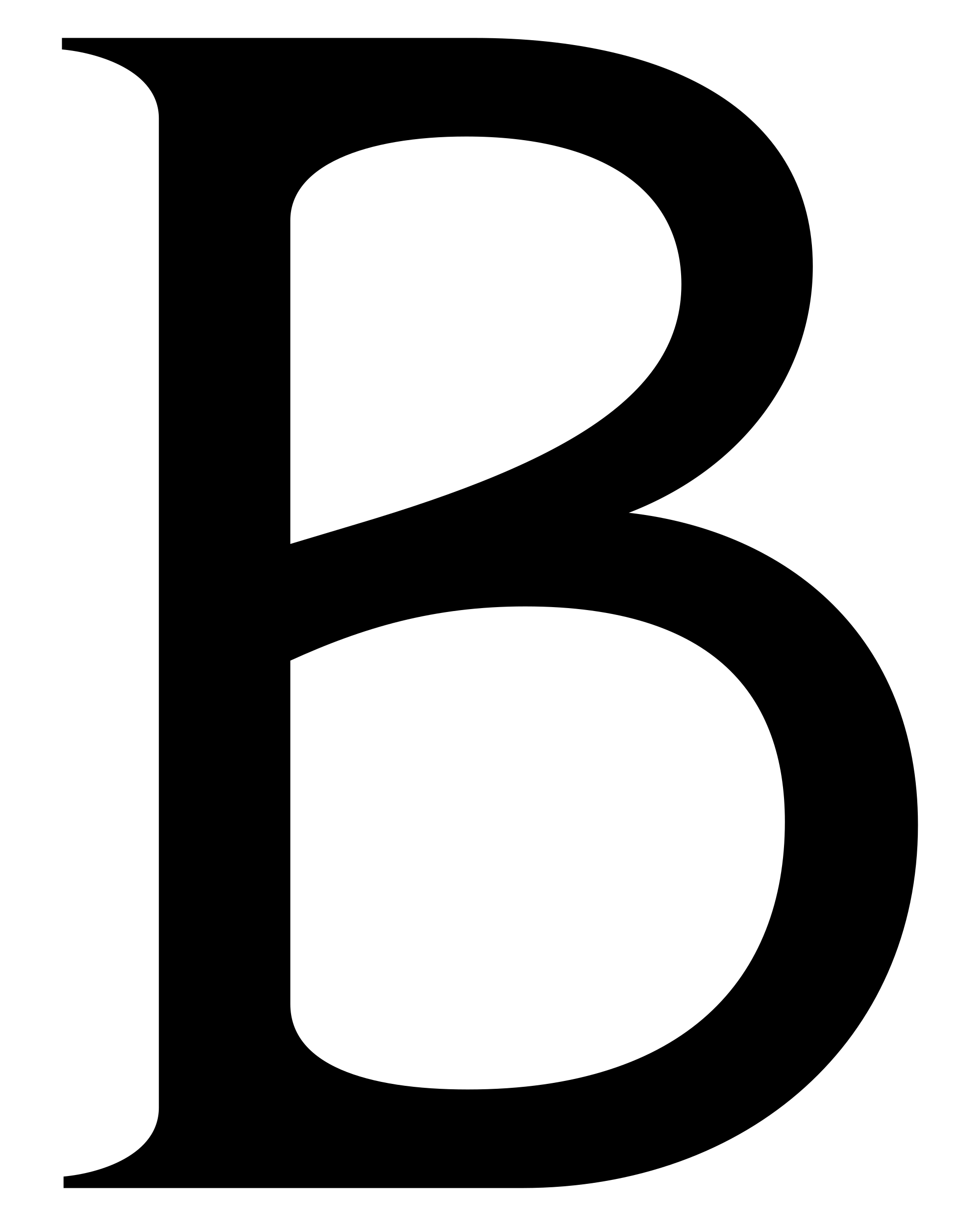
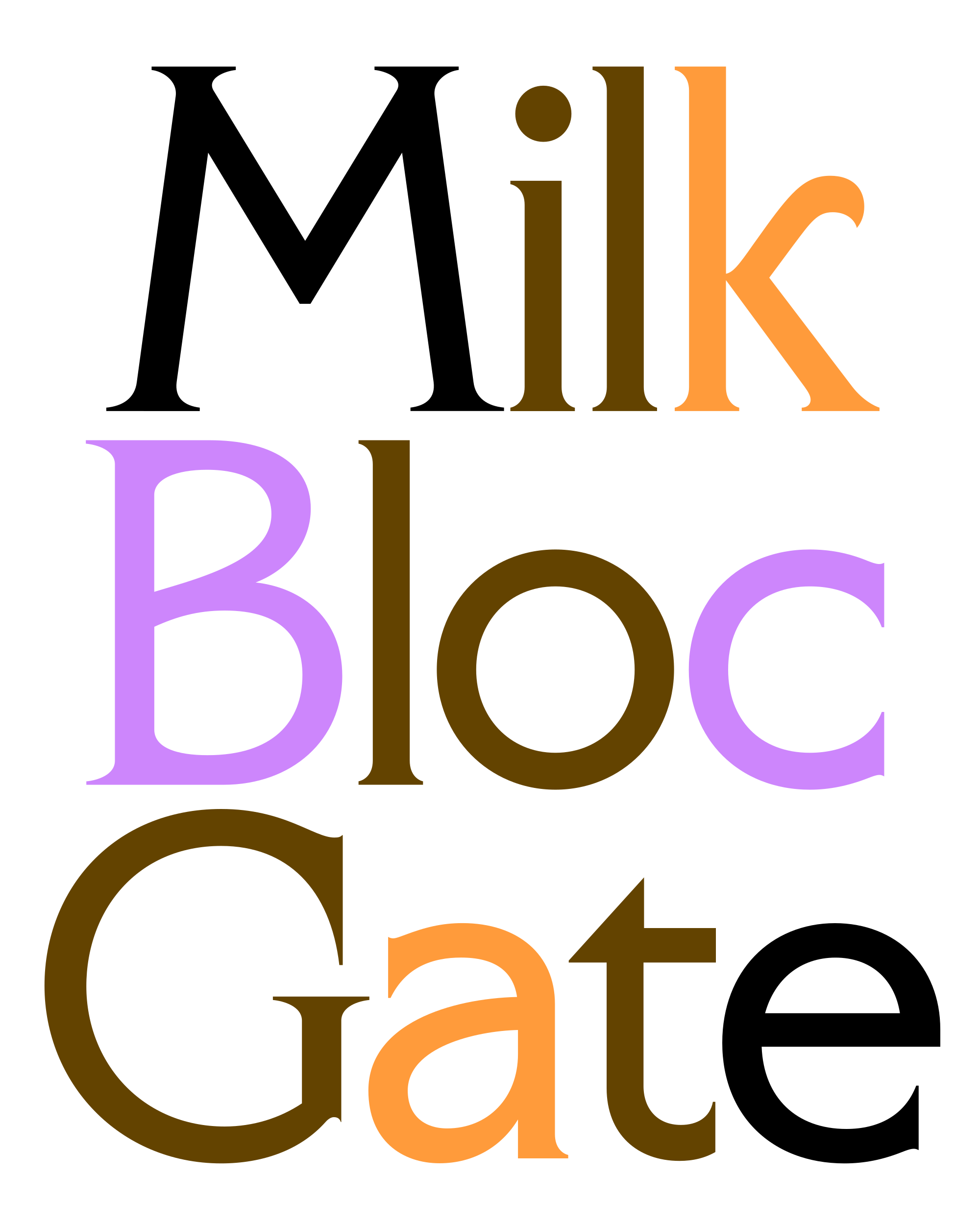
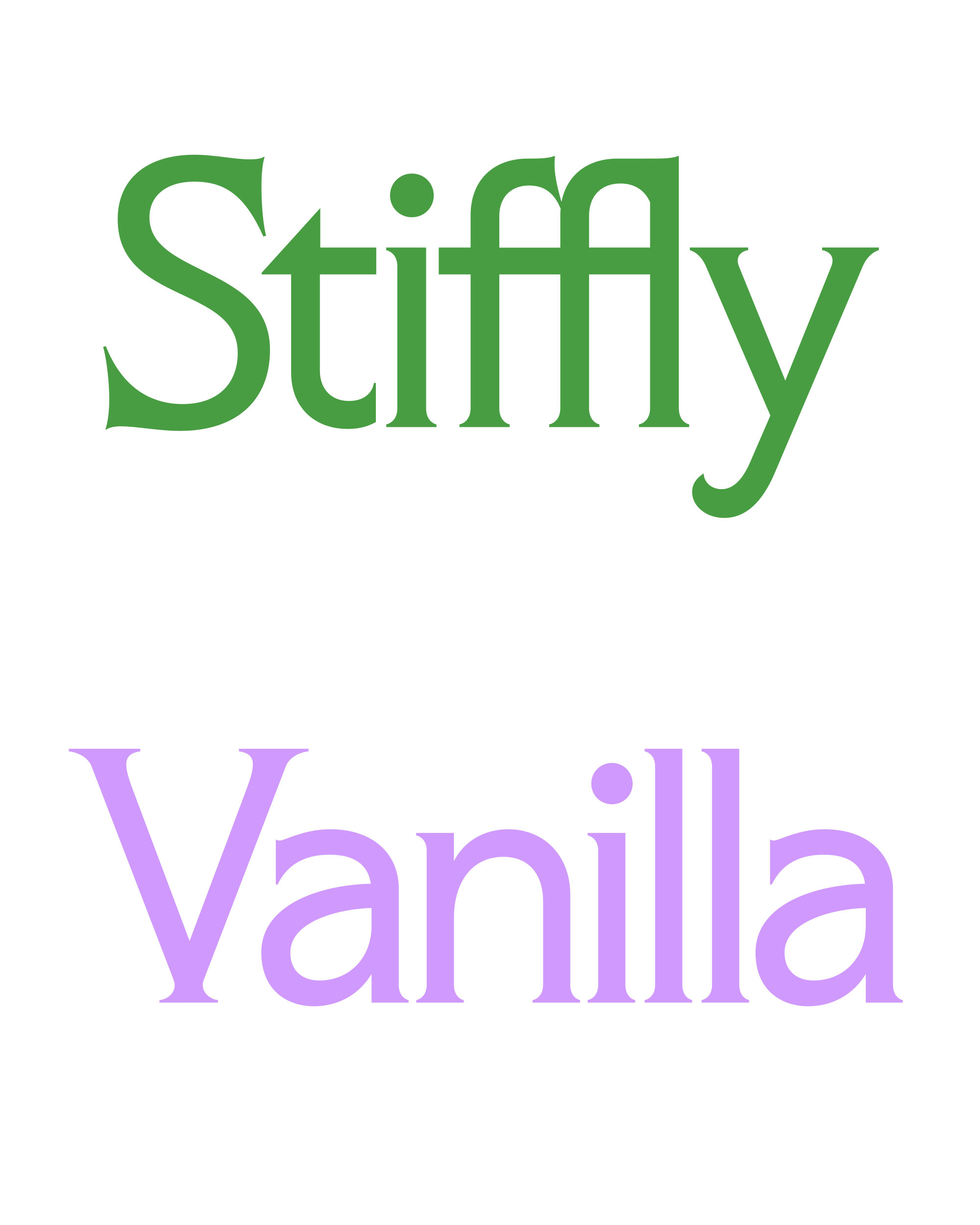
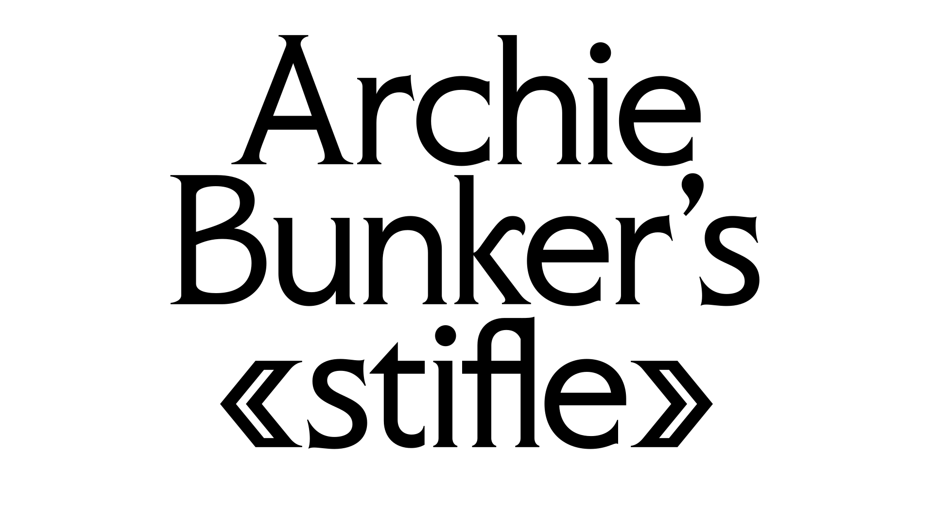
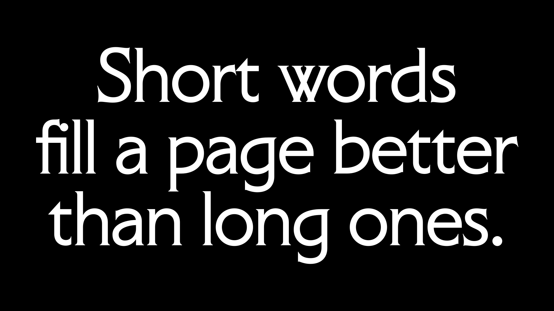
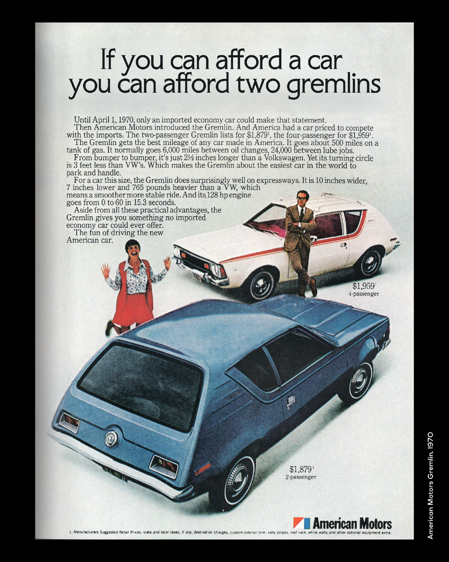
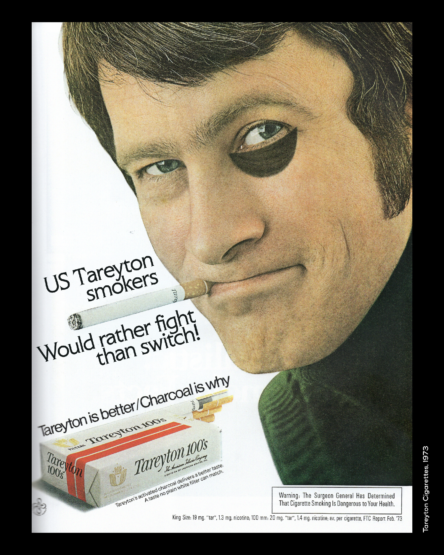
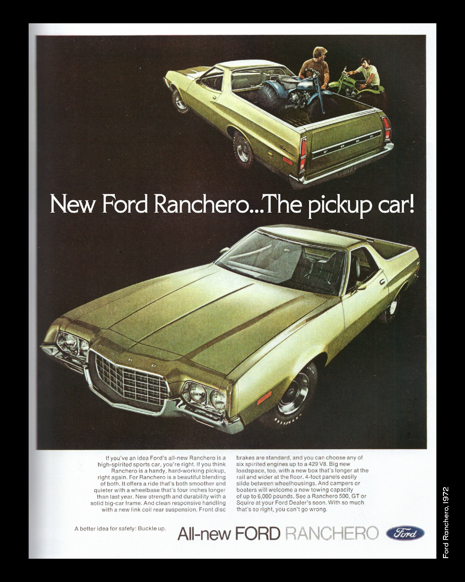
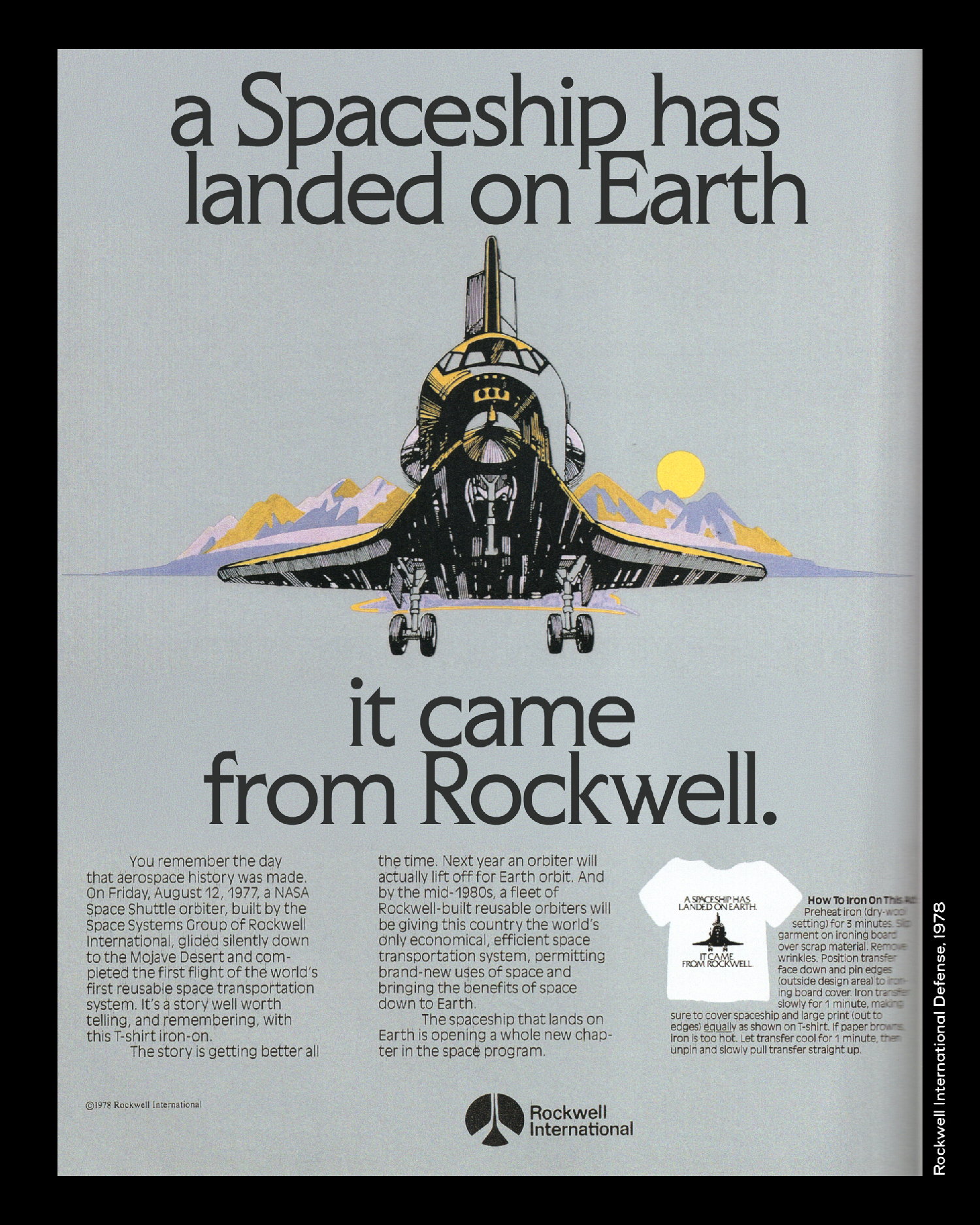
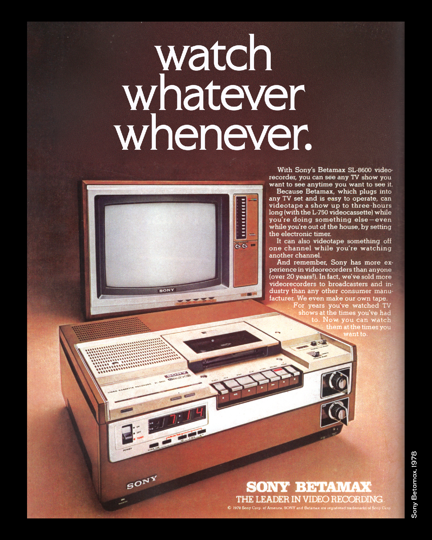
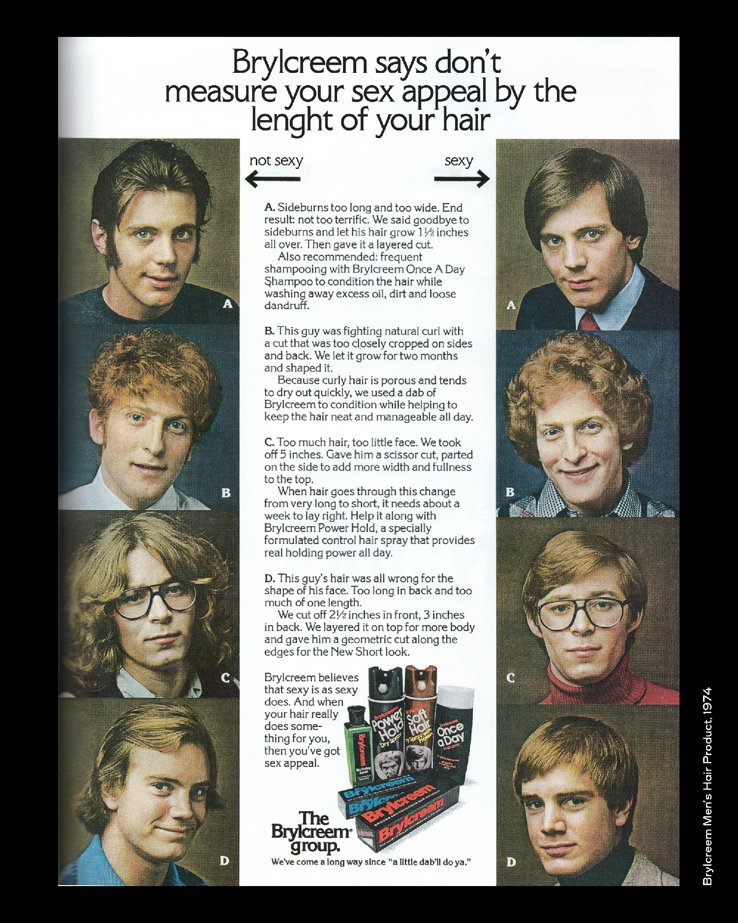
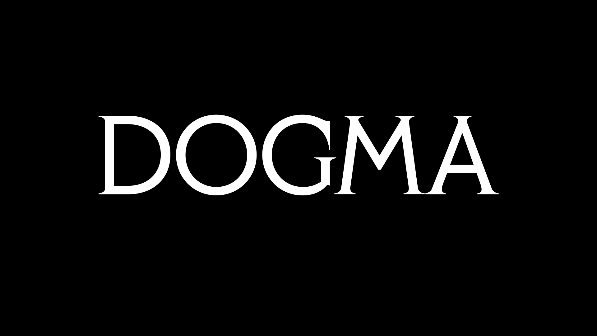
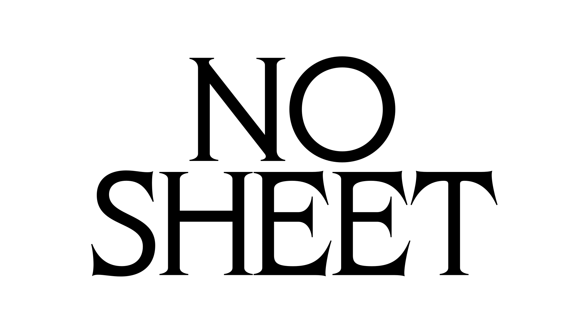
In December 1978, issue 5.4 of U&lc, the magazine published by ITC, ran “My Favorite 5, 6, 7 & 9 Letter Words”, an article by Herb Lubalin and Jack Anson Finks. Lubalin presented the words he liked best, often for the way they looked rather than for what they meant, as his co-author Finks put it: “[Herb] is almost as concerned with the look of a word as he is with its meaning”. Among these words are Alfalfa, Illicitly, Gypsy… To fit this shortened list, he had to leave a few out, including Phlegm, one of his favourites. Eliott Grunewald decided to give the typeface this name as a tribute to the magazine, U&lc, and to its creator Herb Lubalin. The article was set in ITC Benguiat Condensed, released by the foundry a few months earlier, and it is with this typeface by Ed Benguiat that Phlegm begins. Benguiat had himself drawn on the typefaces of the Art Nouveau period, and Phlegm follows the same line, alongside Korinna, Souvenir, Windsor, Richmond, Westminster and Della Robbia. All these typefaces are quite different from one another and were not even designed in the same period, but they belong to the same movement. They share certain features, a certain colour, a tone, all things that have long interested designer Eliott Grunewald. Phlegm is not drawn from any one of them in particular, as a revival so to speak, but it takes inspiration from them and seeks to blend in with them without adopting a style that would feel too dated or historical. In this way it revisits these forms, with its own drawing, its own production and its own uses. It is also part of the legacy of the typefaces that American and European advertising of the 1960s, 70s and 80s used in a strikingly graphic way in its slogans, as the Phlegm specimens on this page show. It keeps their condensed proportions, high-waisted capitals (E, F, B, H, M) and hybrid serifs. The contrast, on the other hand, has been almost entirely removed, at least optically, to give the design a more contemporary feel. Spacing and kerning are tight to keep words compact, and a wide range of alternates and OpenType features lets you set every word to measure, from restrained use to highly graphic compositions. Phlegm is made for headlines, logos and posters. It is at its best at large sizes, but can also work at medium or small sizes depending on the context. First released in uppercase only, Phlegm has included lowercase letters, small caps and an extended character set since October 2026.
Details
Character set: Latin extended
File formats delivered: OTF, TTF, WOFF, WOFF2
Designed by Eliott Grunewald. Development and mastering by Solenn Bordeau and Camille Wisniewski at OTT.
Supported Languages
Afrikaans • Albanian • German • English • Asu • Low German • Lower Sorbian • Basque • Bemba • Bena • Bosnian • Cape Verdean • Catalan • Cebuano • Chewa • Chisena • Cornish • Corsican • Mauritian Creole • Croatian • Danish • Jola-Fonyi • Embu • Spanish • Esperanto • Estonian • Faroese • Filipino • Finnish • French • Friulian • West Frisian • Scottish Gaelic • Galician • Welsh • Ganda • Greenlandic • Gusii • Upper Sorbian • Hungarian • Ido • Indonesian • Interlingua • Interlingue • Irish • Isangu • Icelandic • Italian • Javanese • Jju • Kalenjin • Kamba • Kiga • Kikuyu • Kinyarwanda • Kölsch • Kurdish • Latvian • Ligurian • Lithuanian • Lojban • Lombard • Luo • Luxembourgish • Luyia • Makonde • Makua • Malay • Malagasy • Maltese • Manx • Maori • Matchame • Meru • Northern Ndebele • Southern Ndebele • Dutch • Norwegian Bokmål • Norwegian Nynorsk • Nyankole • Occitan • Oromo • Polish • Portuguese • Rejang • Romansh • Rombo • Romanian • Rundi • Rwa • Samburu • Inari Sami • Northern Sami • Sango • Sardinian • Shambala • Shona • Silesian • Slovak • Slovenian • Soga • Somali • Northern Sotho • Southern Sotho • Sundanese • Swedish • Swiss German • Swahili • Swati • Taita • Taroko • Czech • Teso • Tsonga • Tswana • Turkmen • Vmw • Vunjo • Walloon • Walser • Wolastoqey • Wolof • Xhosa • Zhuang • Zulu